Embea
Empowered Through Beauty
Branding, UX/UI, WordPress development.
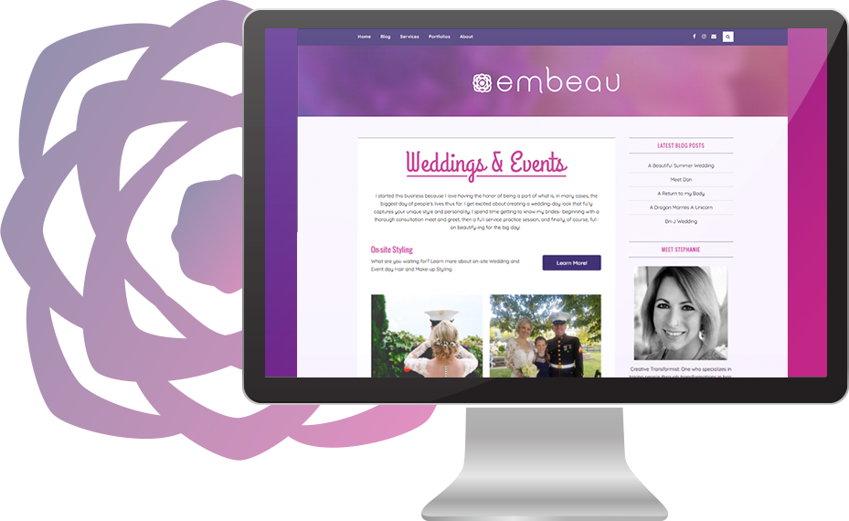
Stephanie was just starting out on her own as a hair and make-up artist, and life coach. She needed a way to inform current and prospective clients of her range of services, showcase her portfolio, and show off her personality.
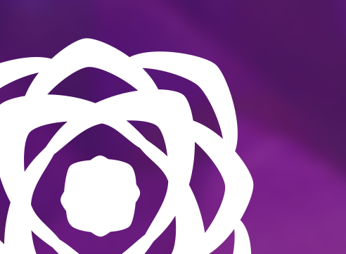
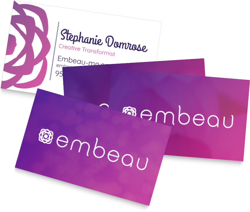
Before I began work on her logo and brand, I asked Stephanie what she most wanted the brand to represent. She said femininity and strength, empowerment through beauty. Flowers are a good representation of this; they grow & bloom into something beautiful.
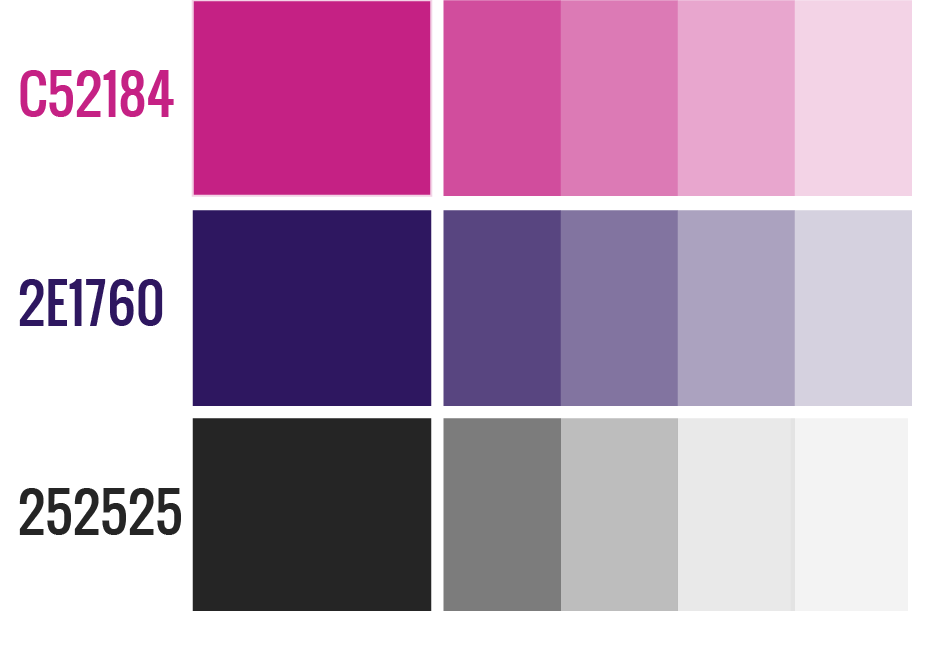
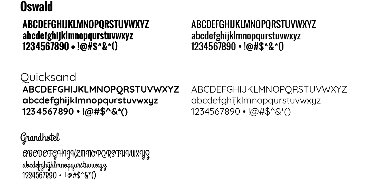
When stylizing the site and marketing materials, I looked for things that represented strength, beauty, and things Stephanie loved (like glitter). A color pallet was designed to be obviously feminine, but also bold; not the typical pastel. The typography is a mix of bold and curvy fonts with a bit of grandness. To guide the user to different area of the site, I illustrated icons incorporating the flower of the overall brand.
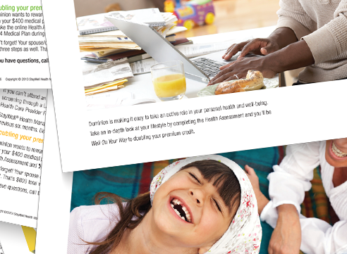
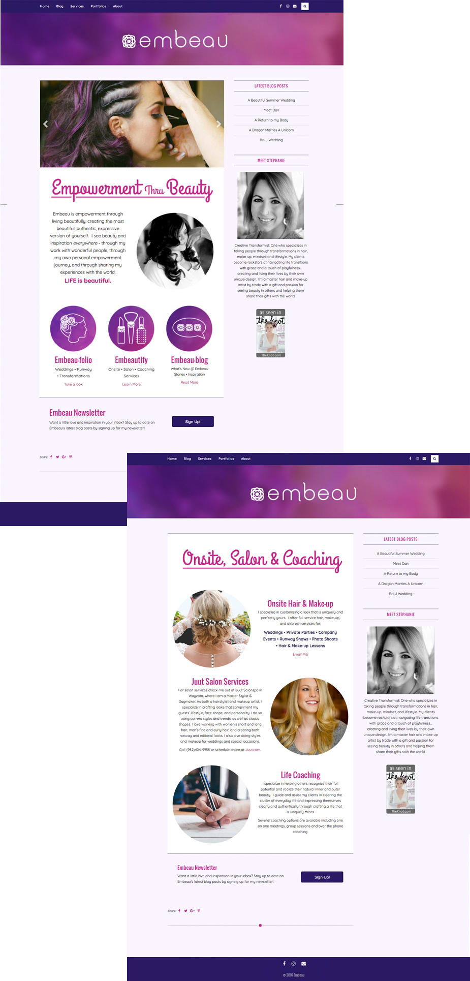
The site was developed in WordPress using a theme that Stephanie chose—one she thought would show off her work and highlight her blog. Once the initial site development was complete, Stephanie took the design to clients for feedback, making sure they where able to easily find what services she offered and how to contact her. In the process we learned that, along with contacting her, they wanted to see more of her styling portfolio, especially for weddings and editorials. This feedback was incorporated into an updated UX/UI design for the site.
Along with branding, design and development of the site, Stephanie was trained in making her own updates and blog posts. This is still very much a “living” site with on-going changes & enhancements. Every couple of months we take a look at the site and see what improvements might be made so that, as her business grows and blooms, so too do her site and brand.
Stephanie was just starting out on her own as a hair and make-up artist, and life coach. She needed a way to inform current and prospective clients of her range of services, showcase her portfolio, and show off her personality.
Before I began work on her logo and brand, I asked Stephanie what she most wanted the brand to represent. She said femininity and strength, empowerment through beauty. Flowers are a good representation of this; they grow & bloom into something beautiful.
When stylizing the site and marketing materials, I looked for things that represented strength, beauty, and things Stephanie loved (like glitter). A color pallet was designed to be obviously feminine, but also bold; not the typical pastel. The typography is a mix of bold and curvy fonts with a bit of grandness. To guide the user to different area of the site, I illustrated icons incorporating the flower of the overall brand.
The site was developed in WordPress using a theme that Stephanie chose—one she thought would show off her work and highlight her blog. Once the initial site development was complete, Stephanie took the design to clients for feedback, making sure they where able to easily find what services she offered and how to contact her. In the process we learned that, along with contacting her, they wanted to see more of her styling portfolio, especially for weddings and editorials. This feedback was incorporated into an updated UX/UI design for the site.
Along with branding, design and development of the site, Stephanie was trained in making her own updates and blog posts. This is still very much a “living” site with on-going changes & enhancements. Every couple of months we take a look at the site and see what improvements might be made so that, as her business grows and blooms, so too do her site and brand.